Rofaqa is an arabic (Doha, Qatar) charity organization that helps orphans. Their aim is to develop advanced, integrated care for orphans including the social educational, health and psychological care for orphans worldwide. Until today, Rofaqa managed to help over 100 000 childrens in need worldwide.
After 5 years of activity the foundation still grows. It brings Rofaqa constantly to a new places. So, due to entering international market, management decided to refresh a little old-fashined logo and brand's visual identity system. The thing that at starting point was just a little inititive, at this point need strong and solid branding system.
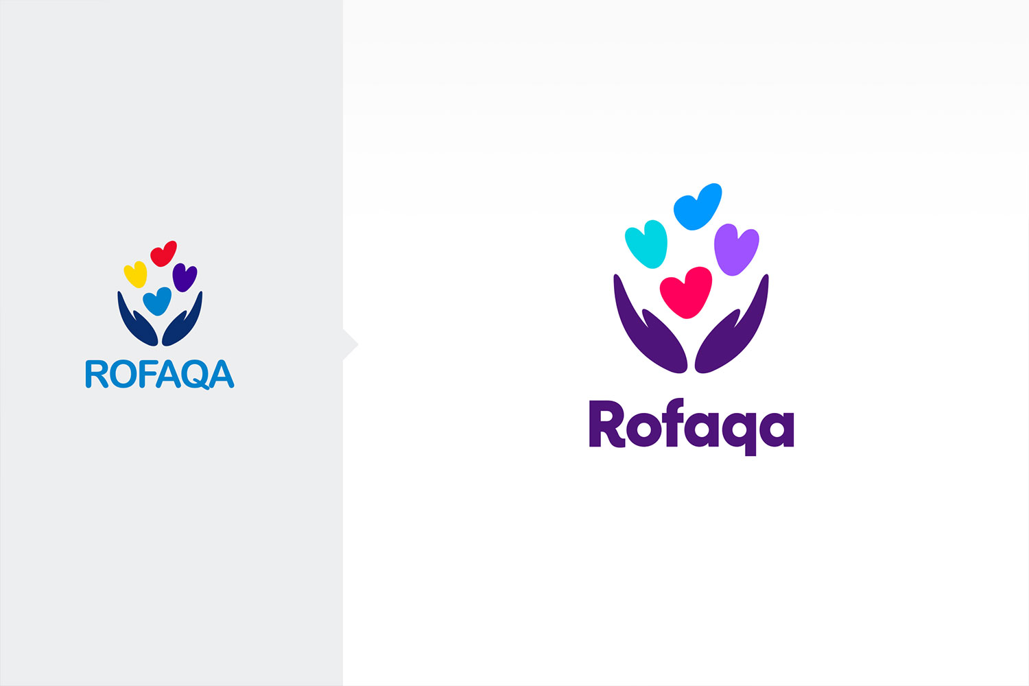
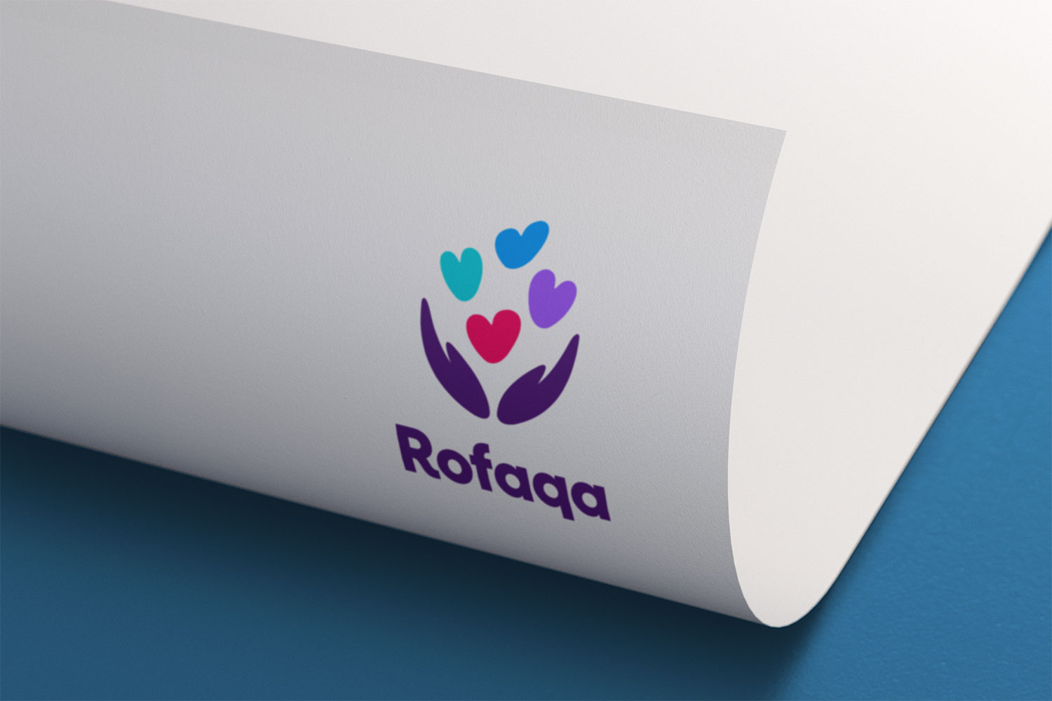
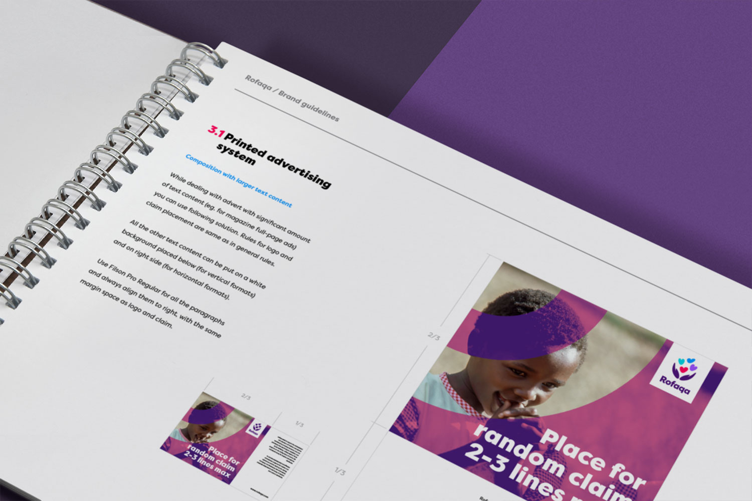
The logo, however, gained some recognition through the years. So we didn't plan big changes. All energy was focused on details, typography and colors. It gave us solid background to build strong and eye-catching identity. Our goal was to show, that Rofaqa brings a bit of happiness (colors) into orphan's lifes. We had created whole communication system. From fonts and colors selection, through key to photo selection and graphic effects, to logo and claim placement.


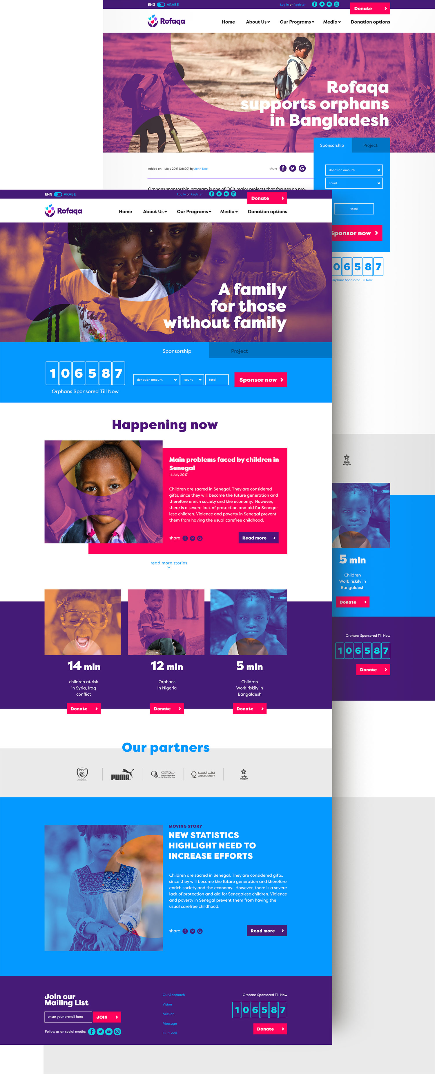
At the end, we did some example promotional materials (folder, notepad, banner and alikes) that will be a model for future graphic materials. We also designed a look&feel for the official website. We hope that the changes (introduced step by step) will quickly work out in the role, and Rofaqa will bring even more joy to the children's lifes.